UX/UI Design > UX Design Certificate Course > Individual Project
DocuGo is an app that acts as a digital storage locker for patients’ medical files and information. The user can create their medical profile and access and share their medical reports and data that is uploaded by their physicians and medical personnel.
By storing this information on the app, the patient and physicians can have access to their patient files at all times, thereby creating a universal patient profile.
Problem
Most patients in India rely on their primary physician to store their medical information and files; or their documents are stashed away in an old briefcase in the back of their closet. When faced with an emergency medical situation time is of the essence. Not having access to medical records at all times might be a source of frustration to people when faced with time sensitive situations.
Lives and time could be saved if people had immediate access to their medical records and files without having to contact any other medical institutions or having to dig through their closets to find them.
Solution
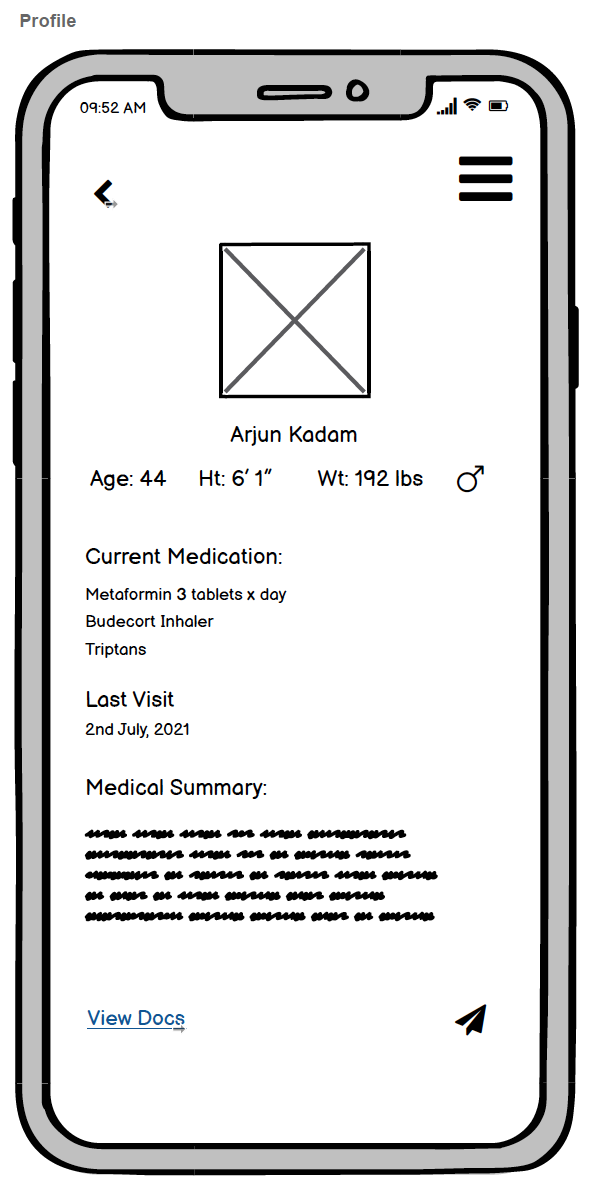
DocuGo is an app which enables patients to build a universal patient profile. The user is able to securely store their important medical information on their phones which can also be viewed by medical personnel and officials.
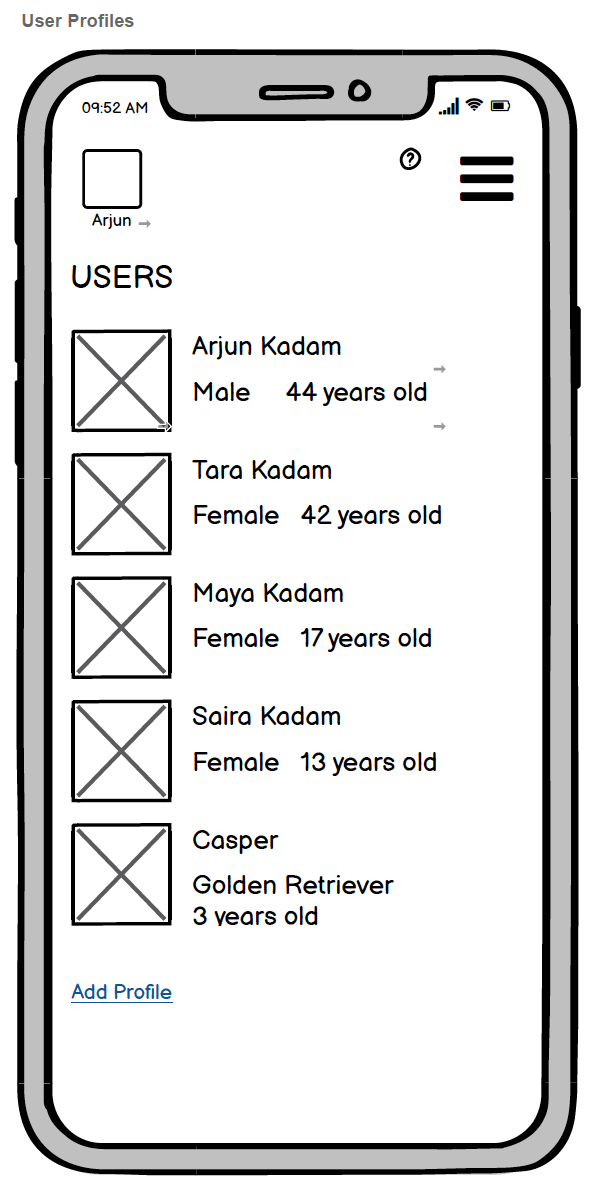
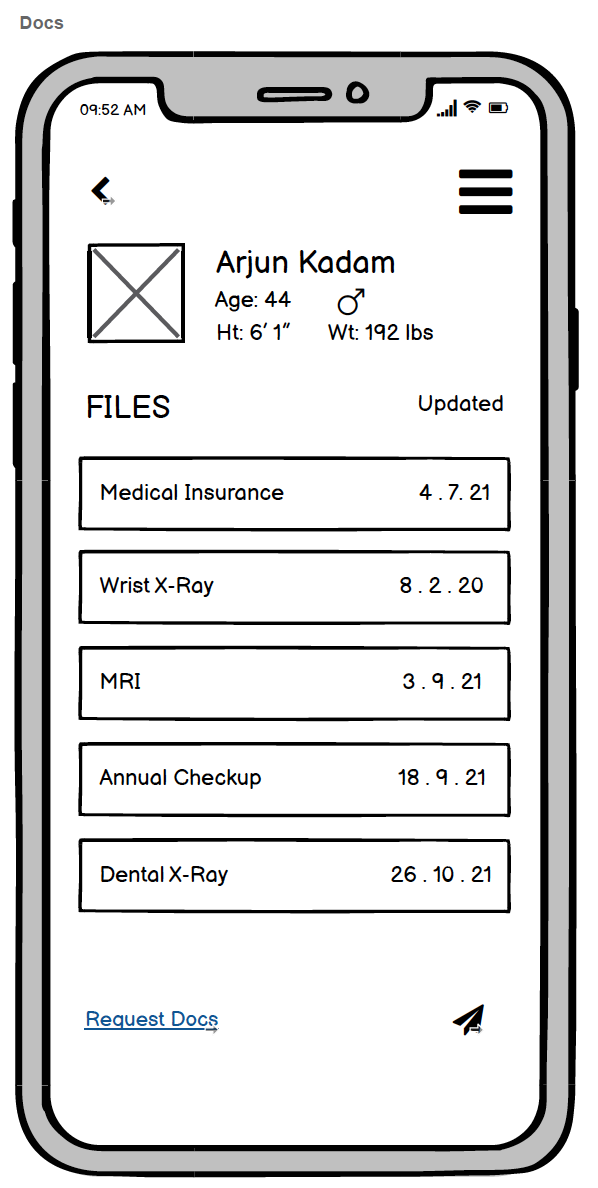
The user can also create profiles for their family members and dependents, including pets so that they have access to each others medical information. With DocuGo, the user can request medical documents from their physician, and share them as well.
Goal
The goal for this project is to design a solution that may assist medical patients by giving them easy access to their personal medical files at all times. The solution would reduce the users’ frustration during their stressful medical experience, especially in an emergency situation.
Process
To start the design process I formulated an interview protocol and recruited three participants for the interview.
Target Audience
People above the age of 18 years who have regular access to a smart phone. The primary user group of the product will be parents and family caretakers. The secondary user would be individuals who are 18 years and above. Other potential stakeholders would include physicians and hospital management.
Interviews
“I think there is a necessity to have the health information be available on the lock screen itself so that there are no accessibility issues when face with an emergency situation.”
- Tarun Ladkhat
“I think it would be really convenient if all the medical history for a patient was available to all physicians so it would be like a universal file.”
- Amiya Chawla
“Maybe it would be better to have the doctor authenticate it (the information) ….because another concern would be hypochondriacs who are afraid and would probably have an endless list of health concerns.”
- Krishna Bhatia
“Okay now that all the information is there, who should see it?….certain types of medical history like history with drug abuse, anxiety issues, etc. could be imperative information to a psychiatrist but you may not want that information to be very public.”
- Amiya Chawla
Affinitizing Activity Notes
“I would actually prefer to have it (DocuGo) for my pets rather than her children since, at least my children would be able to tell somebody what she ate, her allergies but a dog wouldn’t be able to.”
- Krishna Bhatia
*Names changes to protect the identity of the participants
Insights
1. Information should be organized and have easy access to all family members and pet profiles
Explanation: It was found that some families relied on their primary physician clinics to store their medical history and files. If they had files at home, they were not typically organized or updated frequently. A participant also noted the need to maintain medical record of even their pets.
2. Authenticated documents should be uploaded by verified officials for reliable information and easy accessibility
Explanation: To maintain the authenticity of the medical information being stored only verified officials should be given the ability to upload these documents for storage. Otherwise, the information stored could be altered and inaccurate. It was also mentioned that the documents and information should only be accessible to medical personnel and authorized figures.
3. Security concerns regarding information storage
Explanation: There were some concerns with having the private information being stored on a phone since phones may be easy to steal or misplaced. This may result in the information falling into the wrong hands. While there is a need for the information to be easily accessible to important personnel, especially in the time of an emergency, how might we present this information where it is easily accessible, yet secure from prying eyes?
4. Digital Universal patient file that is stored by clinics and the patient
Explanation: Storing information in a digitized format made the information more easily accessible and easily stored. This way the information can be easily stored by both, the clinics and the patients. In the event that the patient has to visit a clinic or hospital that isn’t familiar with their medical history, the patient can easily access and share their information.
Persona
Concept Ideation
The first step was to create a set User Requirements; both Function and Contextual. This was followed by an exploration of the design space through the use of sketches. These sketches were then run by a test participant for their feedback.
Concept Storyboards
Developing User Interface Sketches
Creating A Paper Prototype
Based on the design concept and the UI sketches I constructed, this interactive paper prototype illustrates how the concept will be interactive, responding to user actions to complete the tasks, defined for the design.
Medium Fidelity Prototype
Creating interactive wireframes using BalsamiqIn comparison to the paper prototype, I added a few more features. I included a help icon on the home page so that the user can navigate themselves out a tough situation and so that they are able to receive all the information that they would require from the app itself. I also eliminated certain buttons. I realized that descriptive written texts with links might work more effectively that a simple button with an icon. I also rephrased certain headings so it looked clean and concise. I also played around with the placement of the sub headings to give it a more clean and hierarchal structure.


Heuristic Evaluation
The next step of the process was to conduct a heuristic evaluation of the prototype and then propose solutions to the problems that were identified. For the evaluation, I chose to follow Nielsen’s Ten Usability Heuristics Procedure.
Creating a High Fidelity Prototype
Using FigmaBased on the medium fidelity prototype and the insights generated from the heuristics evaluation, I created a high fidelity interactive prototype.
When designing this prototype I tried to choose a soothing color palette. While red is often related to health related ventures, I thought that it may seem too alarming. I really focused on creating a simple and easy to use app given the context for which it has been designed. It was designed to be user friendly to all age groups and easy to learn.
Usability Testing
I wanted to test the accessibility and utility of the app interface and icons.
With this test I wanted to study whether the users can navigate through the app seamlessly and effectively. Since the goal of this app is to simplify the documentation process of medical information and reports I wanted to test whether the user found it easier to learn and use this app and if it does, in fact simplify the process.
From the feedback received from the usability test, we identified UX Design Problems (UDPs) and UX Problem Instances (UPIs)
These factors were taken into consideration and the design accommodated these changes in the next iteration.
UX Design Problems (UDPs)
Final Prototype
UX Problem Instances (UPIs)
You can interact with the High Fidelity Prototype of DocuGo as well.


